


This tutorial will walk you through how to customize Age Verification Pop-up, allowing you to align it with your store’s branding.
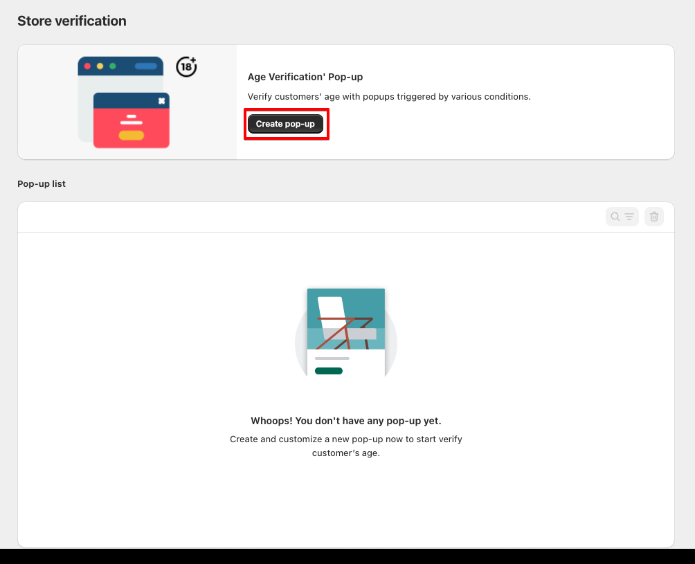
Open Age Verification Pop-up in Shopify
- From your Shopify admin dashboard, navigate to Age Verification Pop-up.
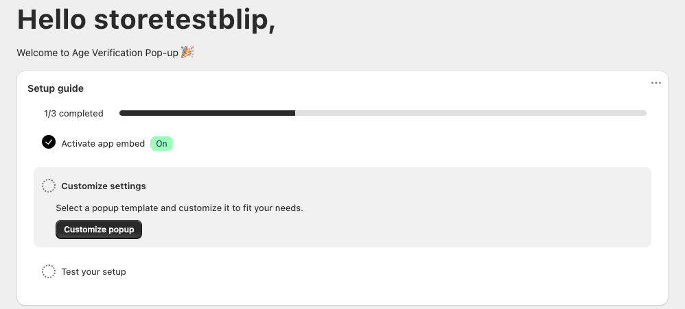
- Select the Store verification tab.
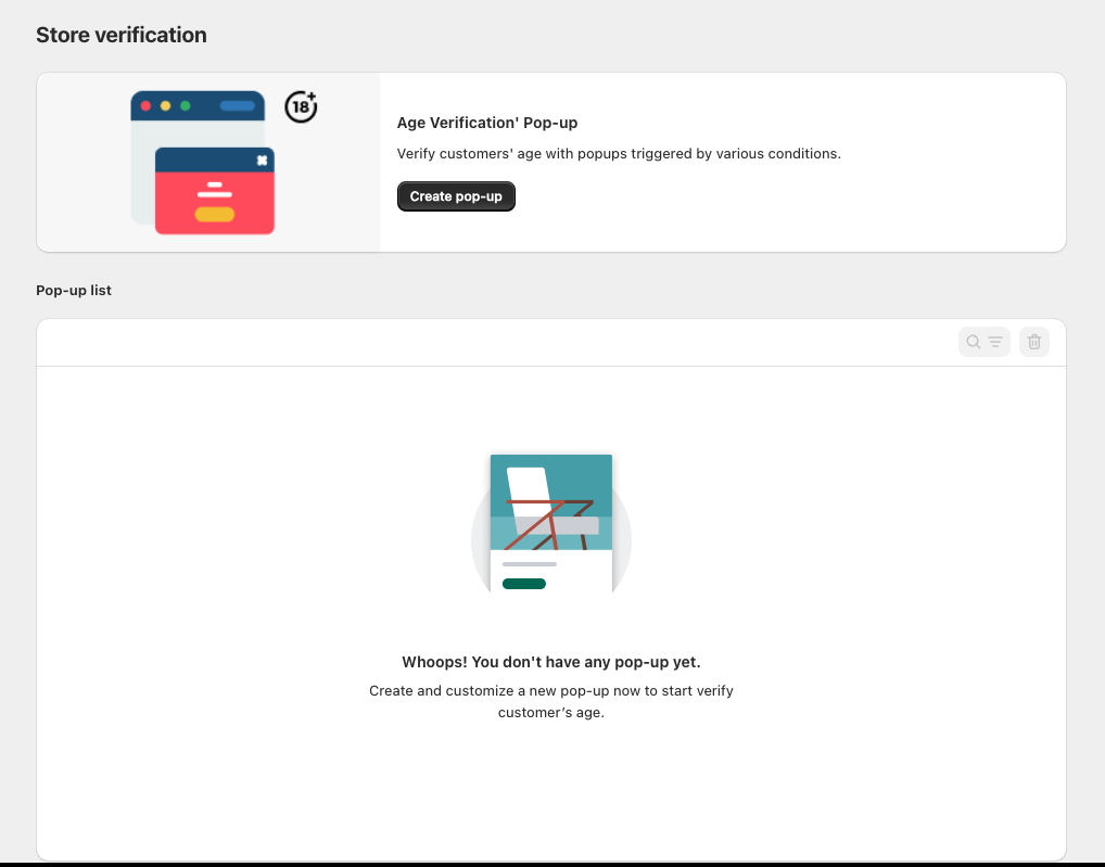
- Select the Create pop-up button.
Guide to Configuring the Pop-up – “Info” Tab
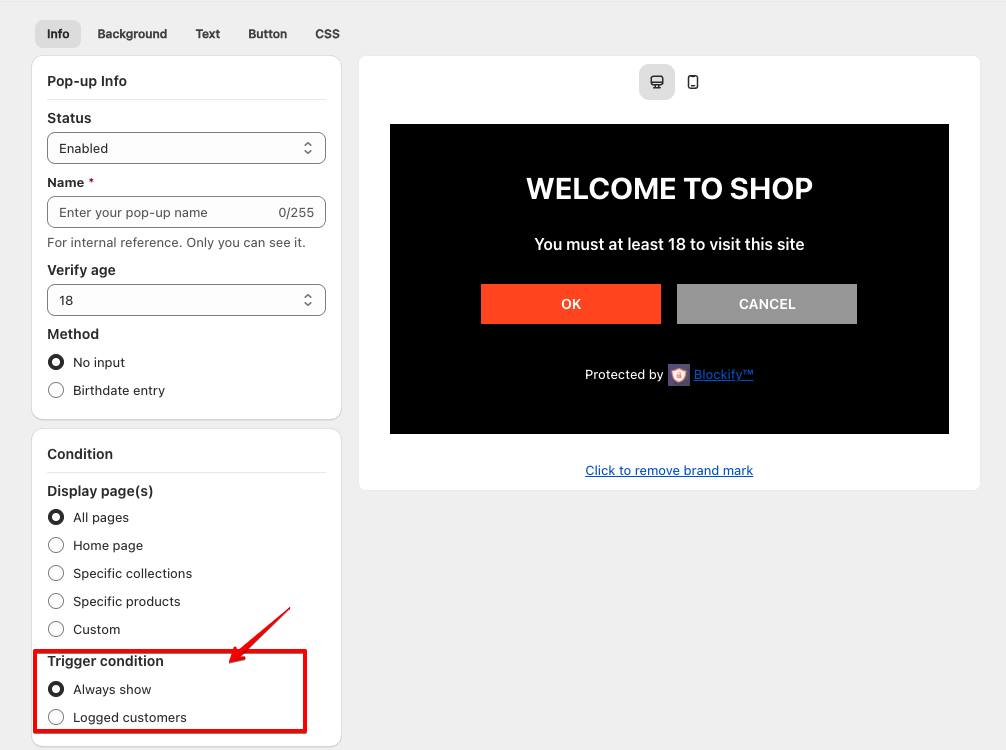
- Pop-up Info
Status:
- Select Enabled to activate the pop-up.
- Select Disabled to deactivate it.
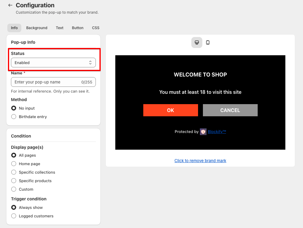
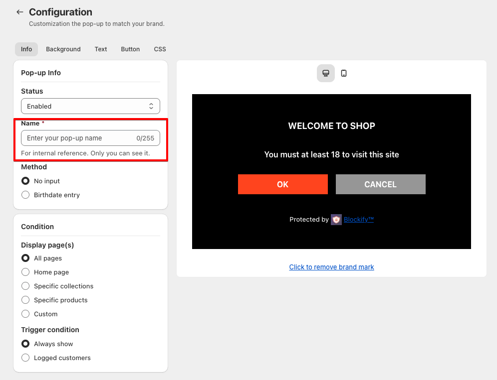
Name (Required):
- Enter a name for internal reference.
- Only administrators can see this name.
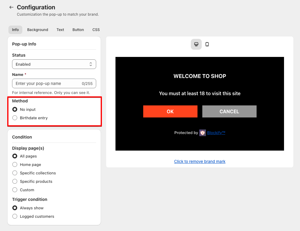
Method:
- No input: Customers only need to click “OK” to confirm.
- Birthdate entry: Customers must enter their birthdate to verify their age
Verify Age:
- Choose the minimum age required for customers to access the website.
- Example: Select 18 if only users aged 18 or older should be allowed.
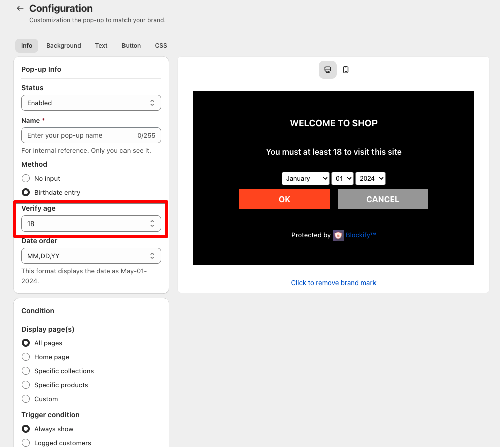
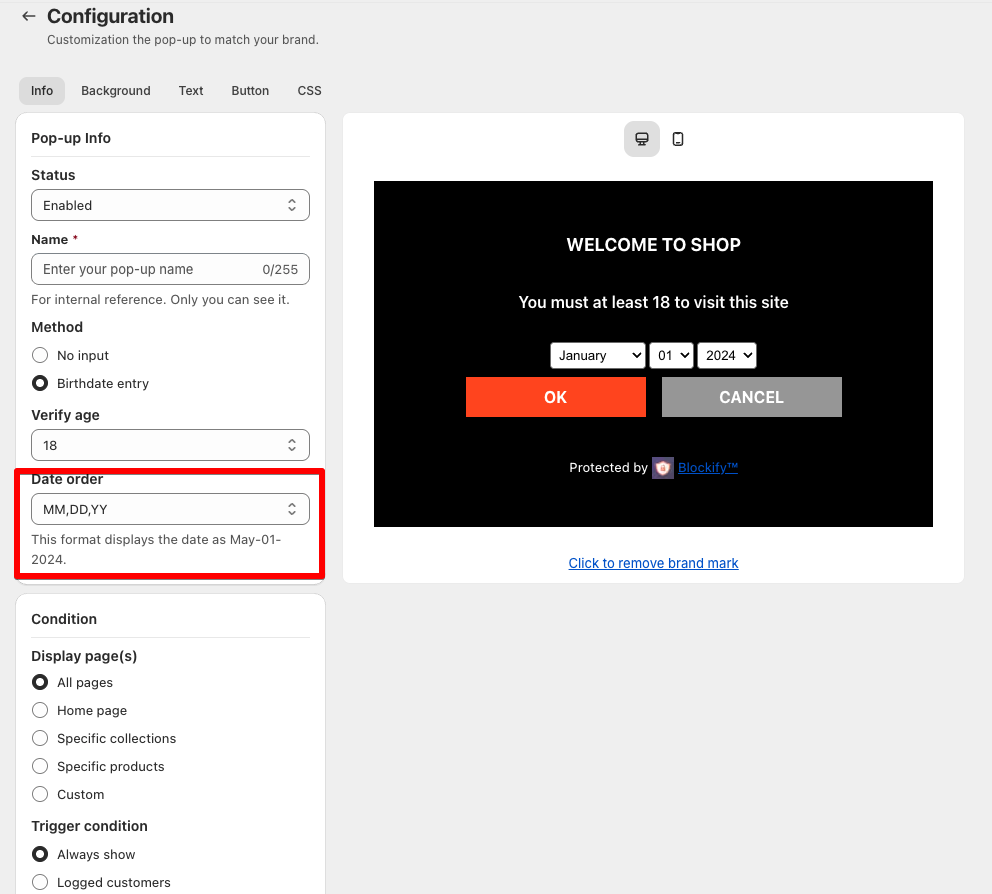
- Select the date order
- Condition
Display page(s):
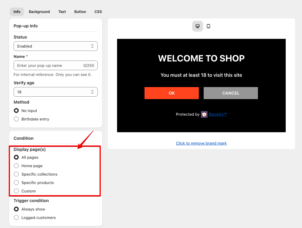
- All pages – The pop-up will appear on all pages of the website.
- Home page – The pop-up will only be displayed on the homepage.
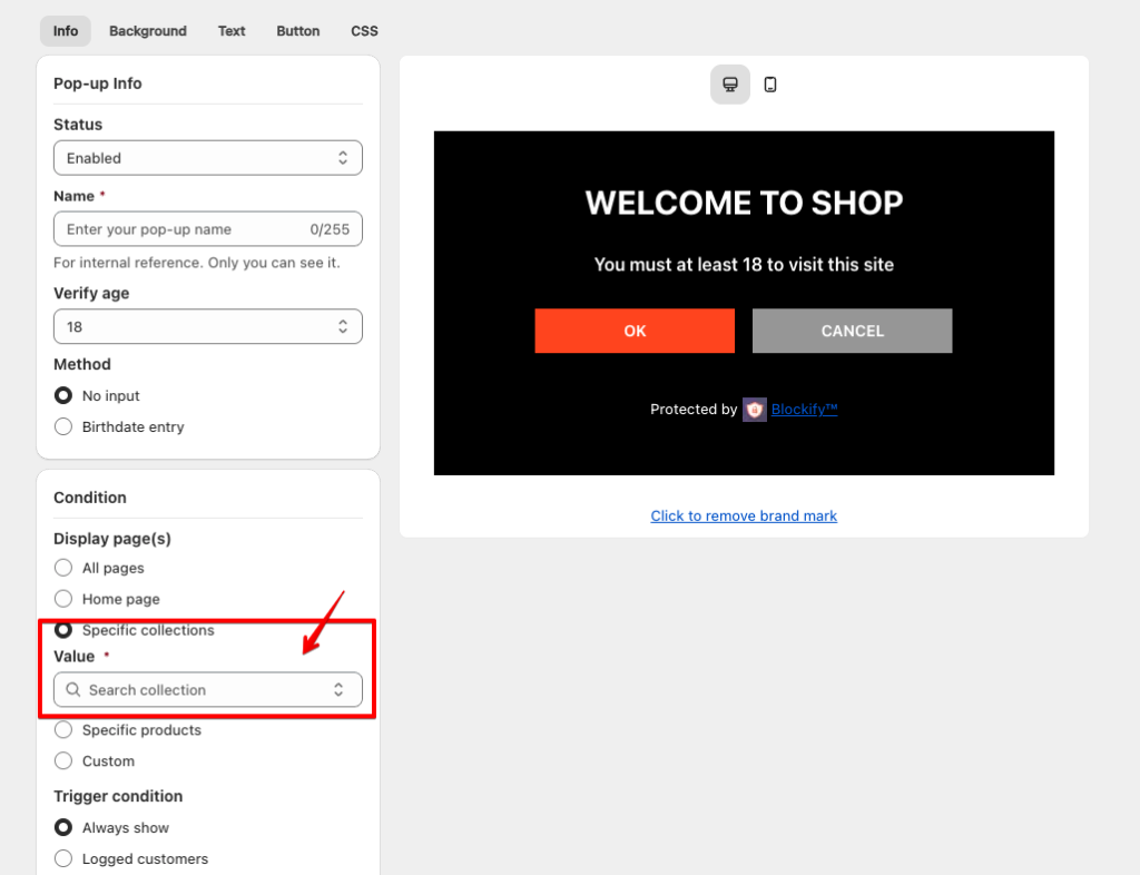
- Specific collections – Choose specific product collections where the pop-up should appear.
- Specific products – Apply the pop-up to selected products only.

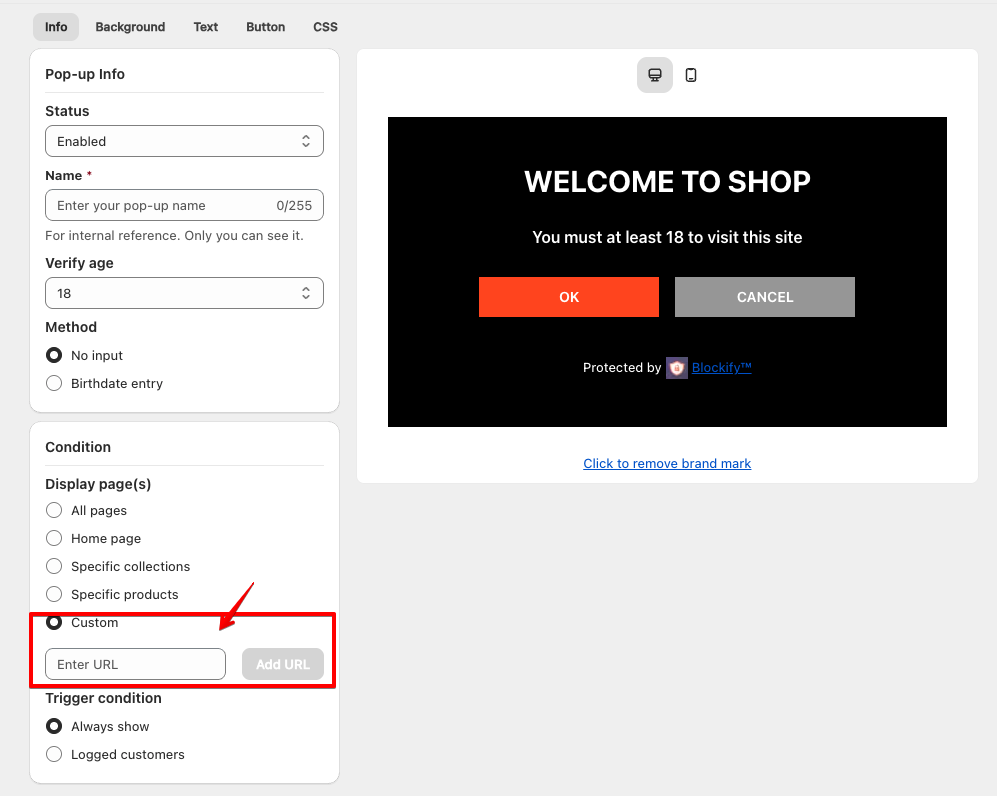
- Custom – Customize the display pages as needed.
Trigger condition:
- Always show – The pop-up will appear every time a visitor accesses the page.
- Logged customers – The pop-up will only appear for users who are not logged in.
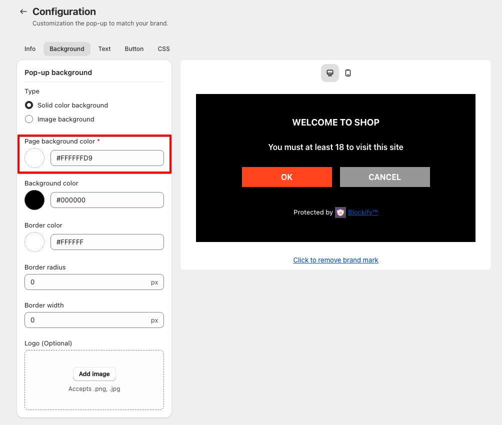
Background Customization Guide
- Customize Background
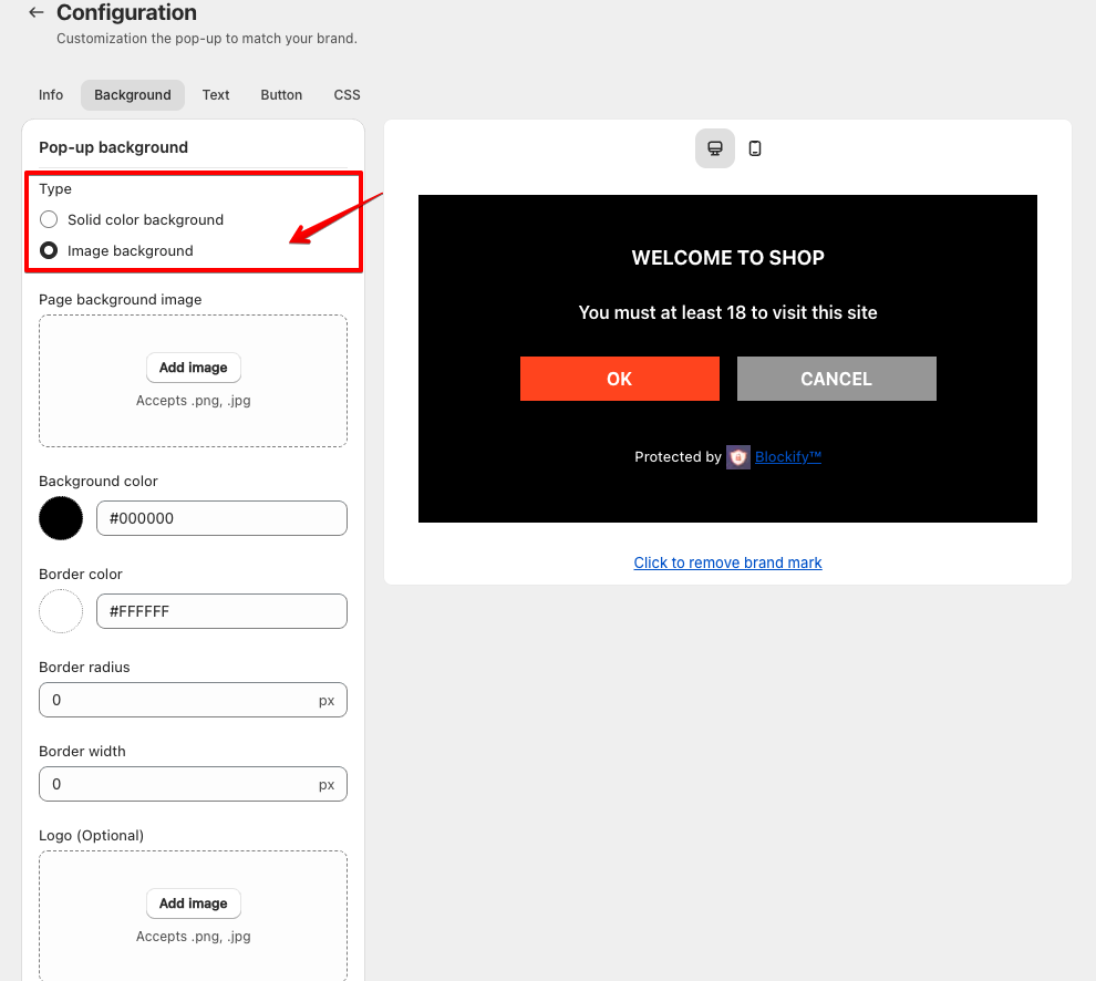
Solid color background:
- Select this option to use a solid color as the background for the pop-up.
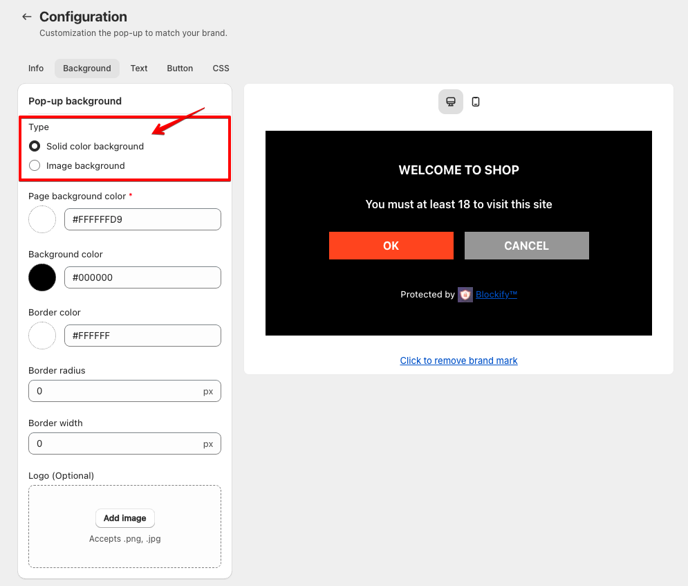
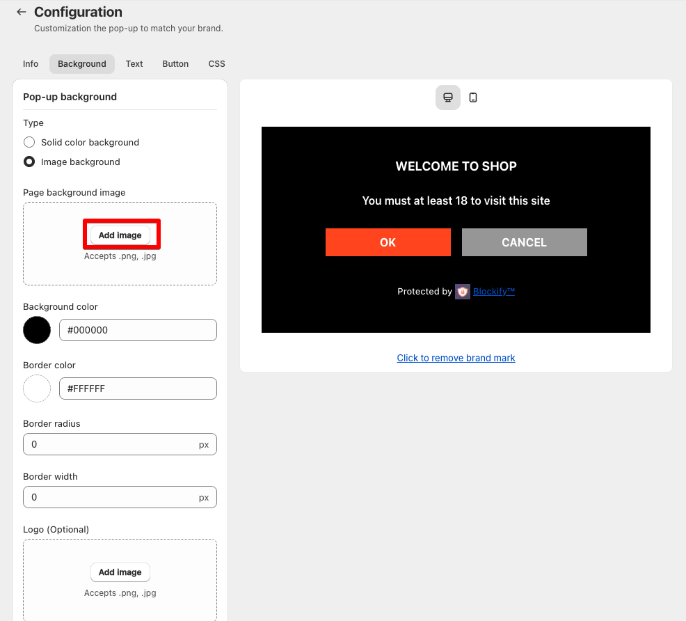
- Or upload a custom image that is relevant to the content of the page or your brand.
Color:
- If using a solid color, specify the desired hex code in the “Page background color” field.
Note: In case you select “Default” for a solid color background.
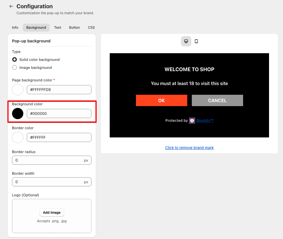
- Set Pop-up Background color:
- Enter a hex code for the popup itself in the “Background color” field.
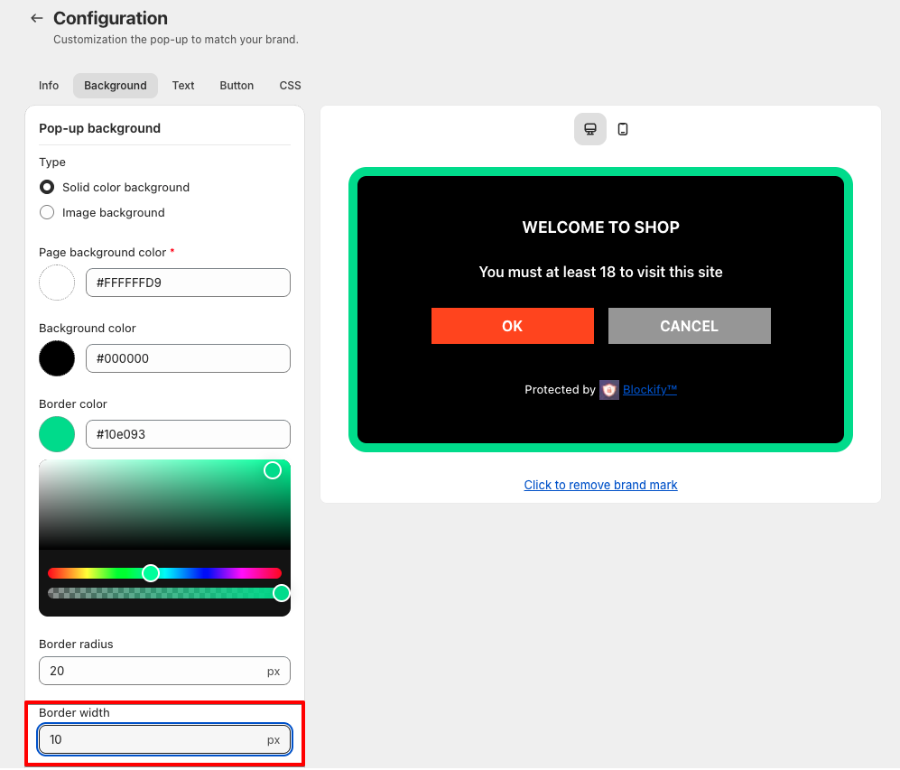
- Set Border color:
- Choose the color of the pop-up border (e.g., #10e093)
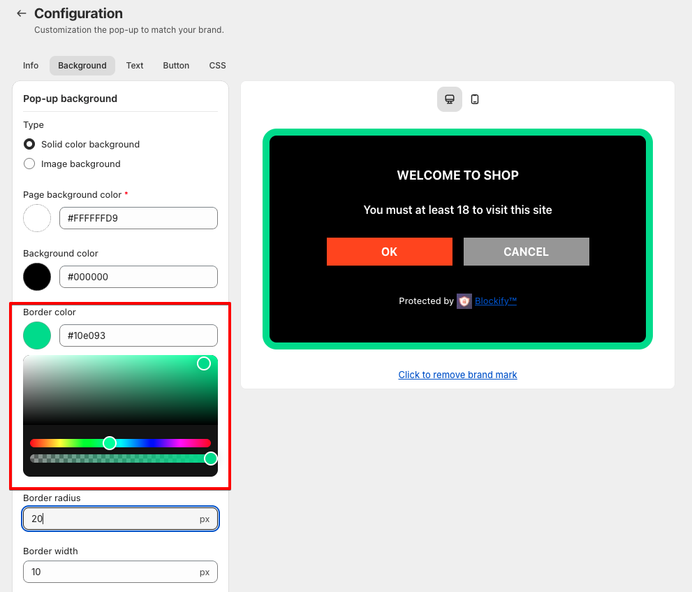
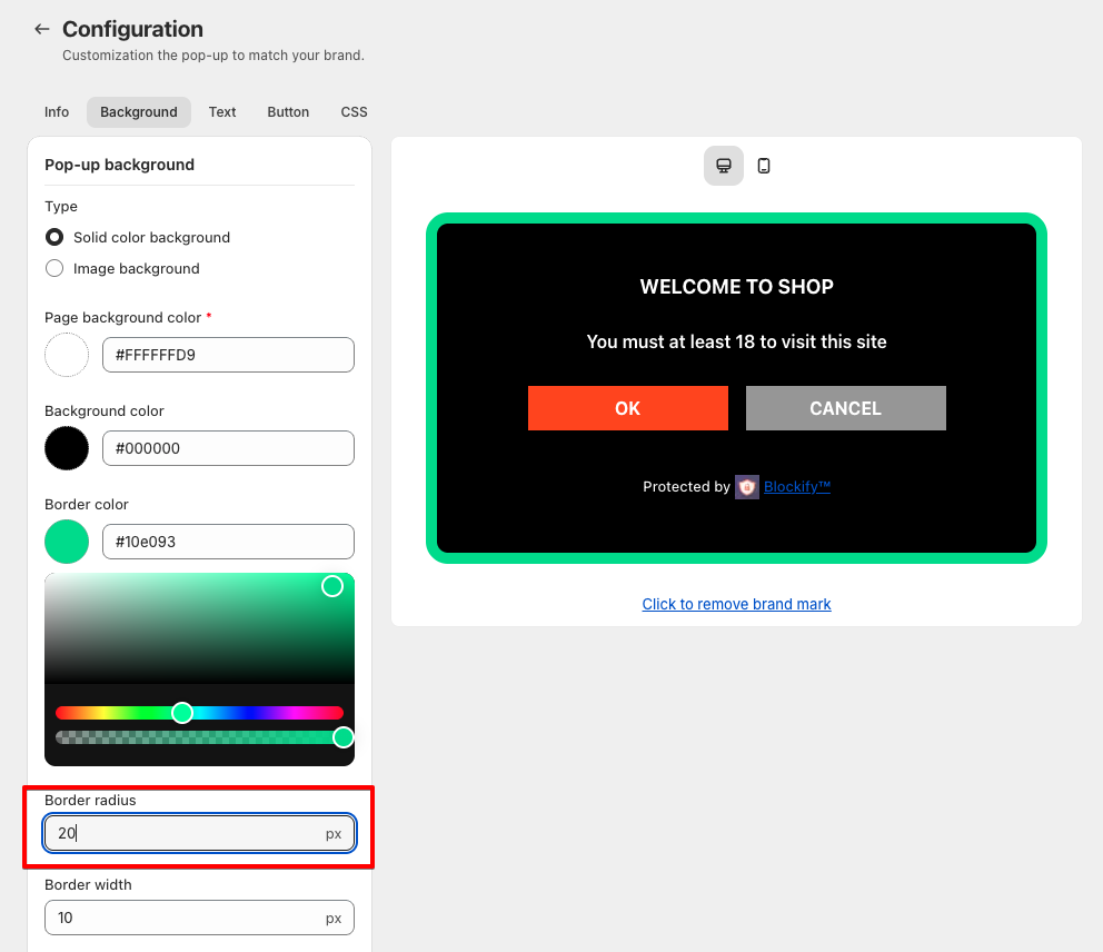
- Set the roundness of the pop-up corners. Enter a value in pixels (e.g., 20px)
- Define the thickness of the border in pixels (e.g., 10px)
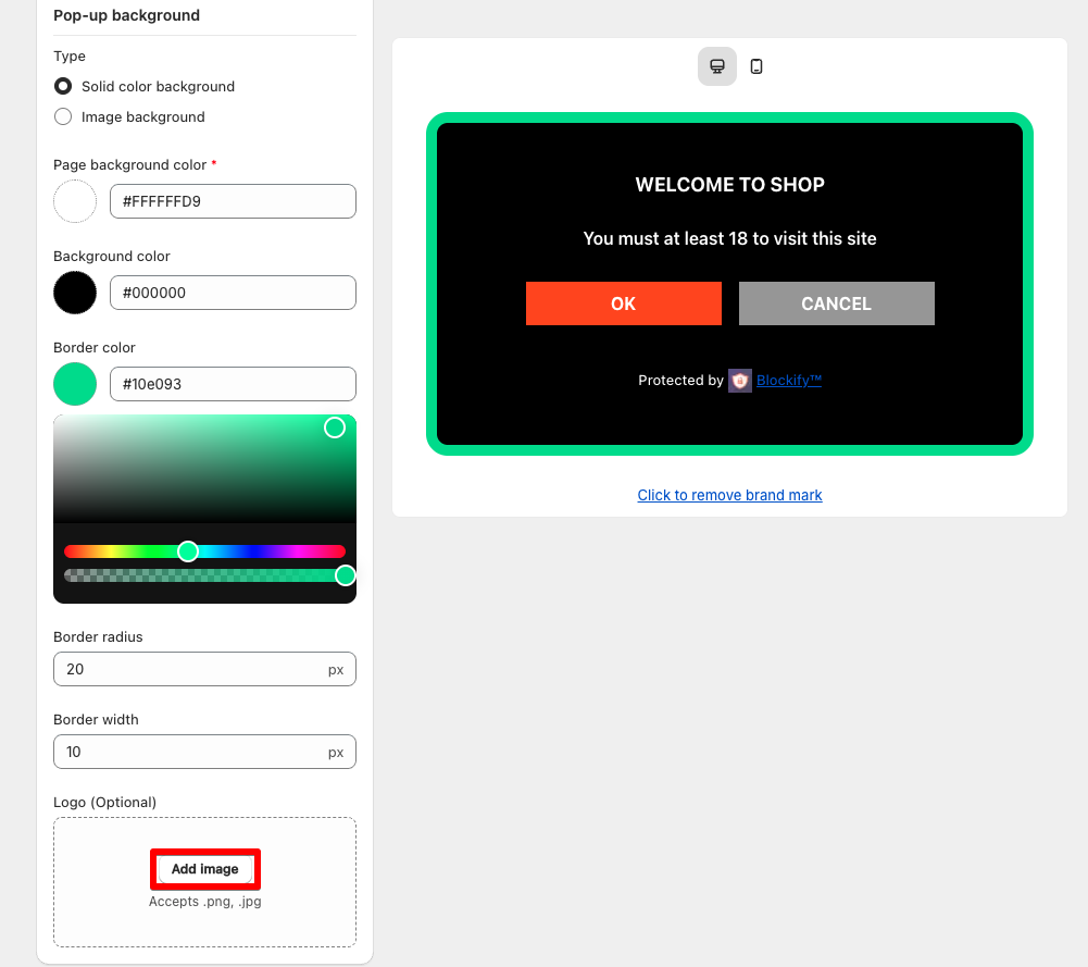
- Add a Logo (Optional):
- Upload a logo in
.pnjor.jpgformat to further customize the pop-up.
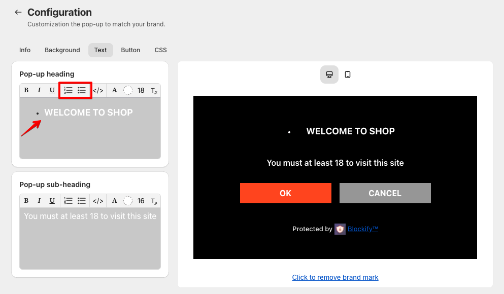
Text Customization Guide
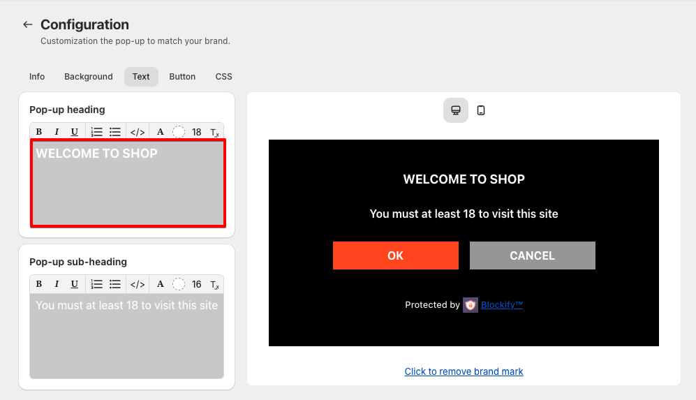
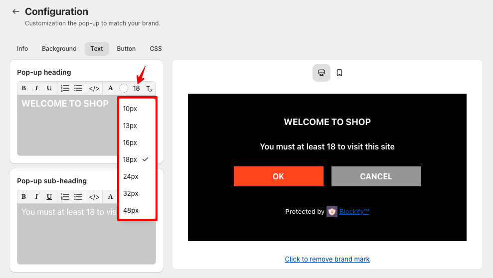
- Heading Text:
- Enter the main message in the “Heading text” field.
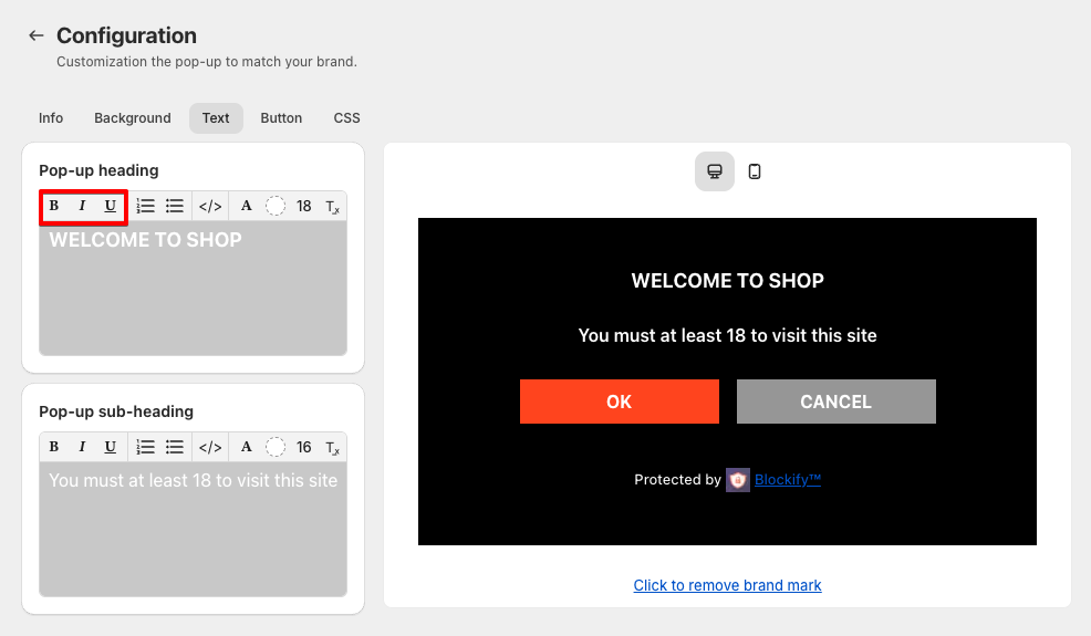
- Use the formatting options (Bold, Italic, Underline) to style the text.
- Align the text to the left, center, or right using the alignment buttons.
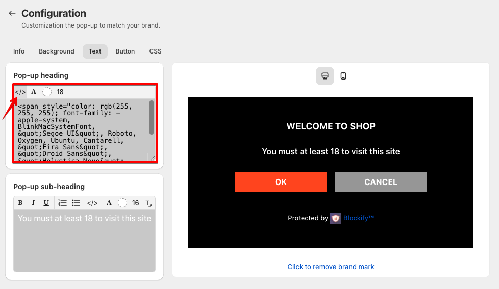
- Add custom HTML by clicking the
</>icon for advanced formatting.
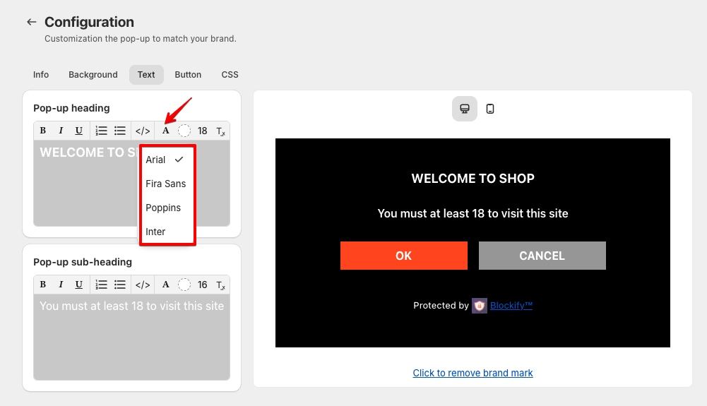
- Customize the font of the text.
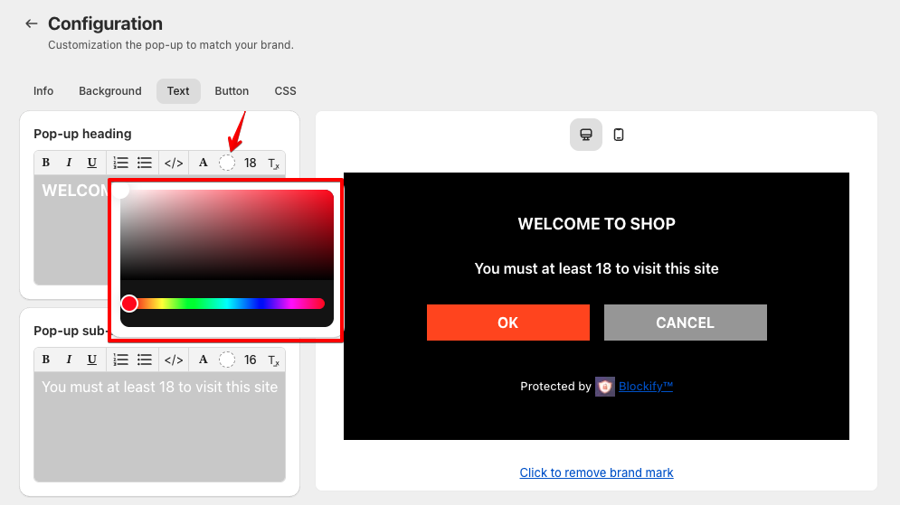
- Adjust the font size and color using the text size and color options.
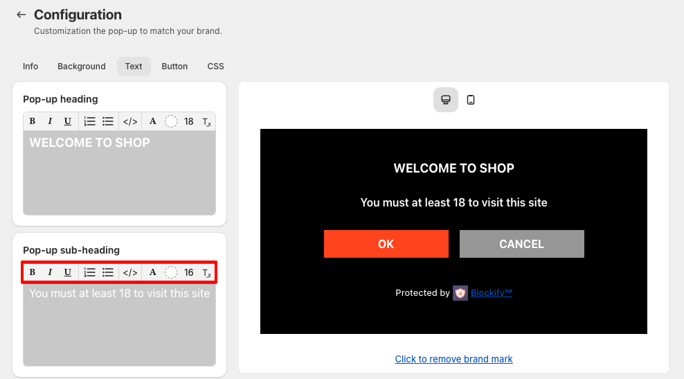
- Sub-heading Text:
- Enter supporting information, such as age restrictions, in the “Sub-heading text” field.
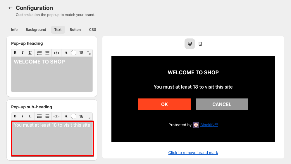
- Customize the sub-heading the same way as the pop-up heading.
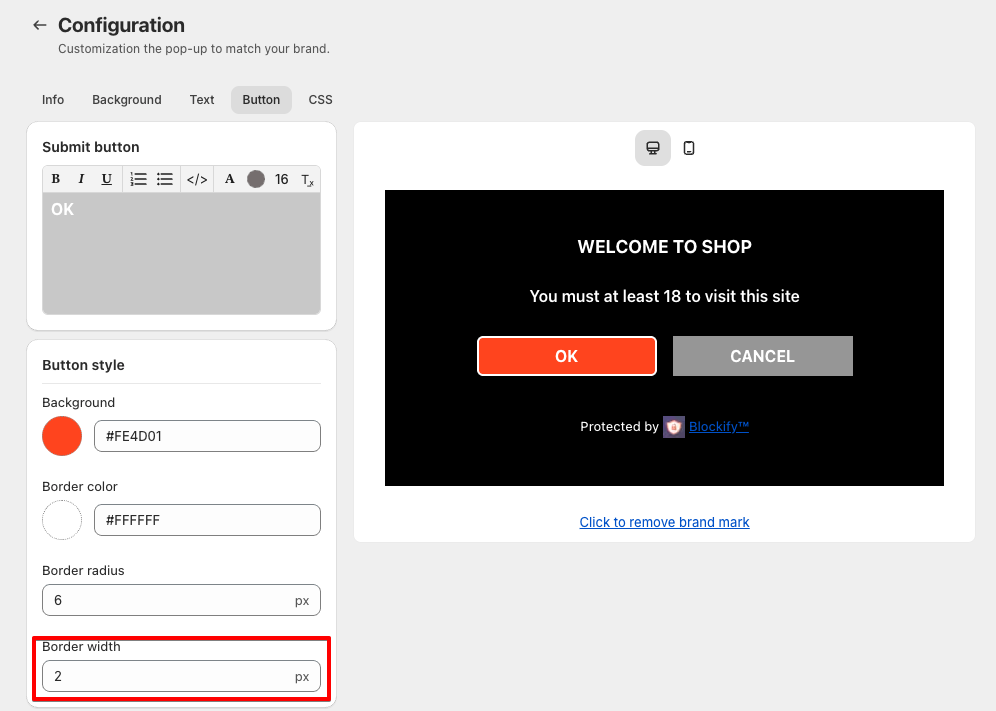
Button Customization Guide
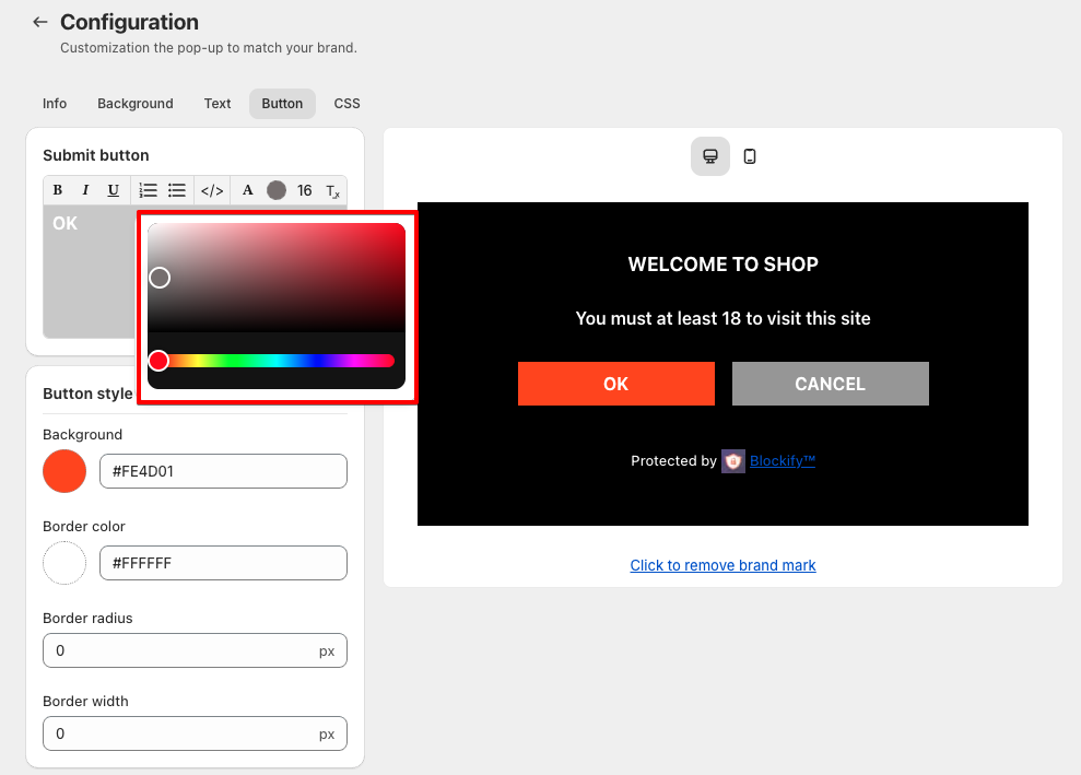
- Customize Submit Button
Submit button
- Enter the button label (e.g., OK) in the “Submit button” field.
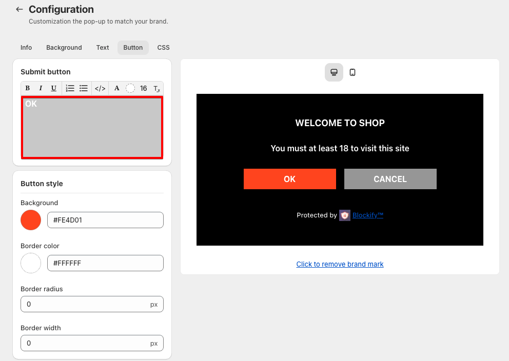
- Use formatting tools to style the text (bold, italic, underline).
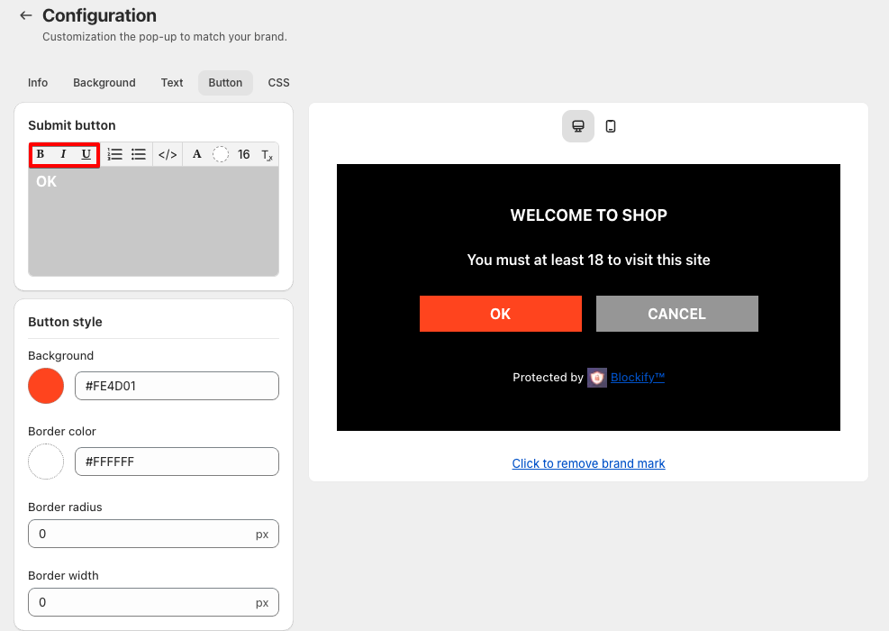
- Align the text to the left, center, or right using the alignment buttons.
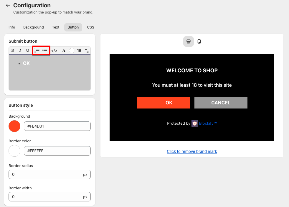
- Customize the font of the text.
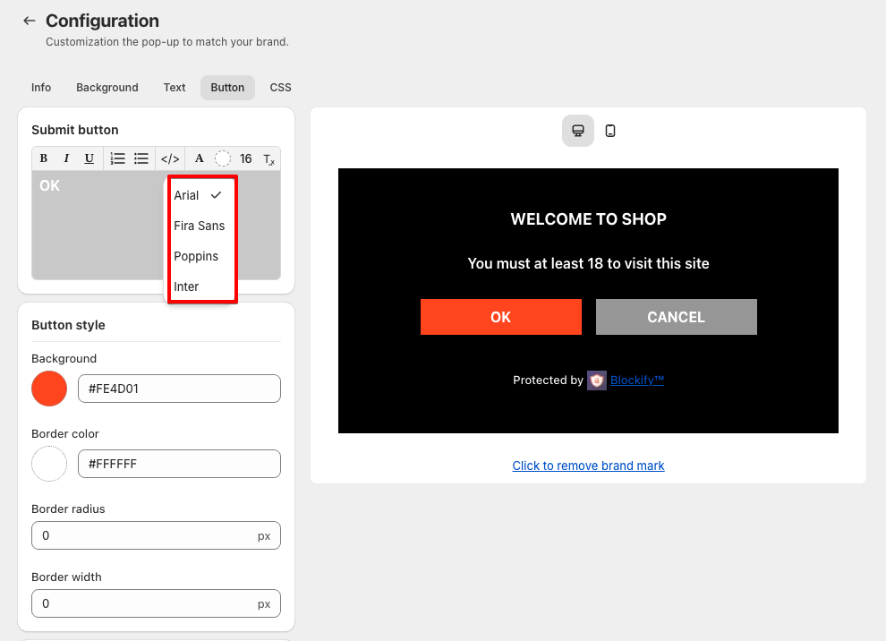
- Adjust the font size and color using the text size and color options.
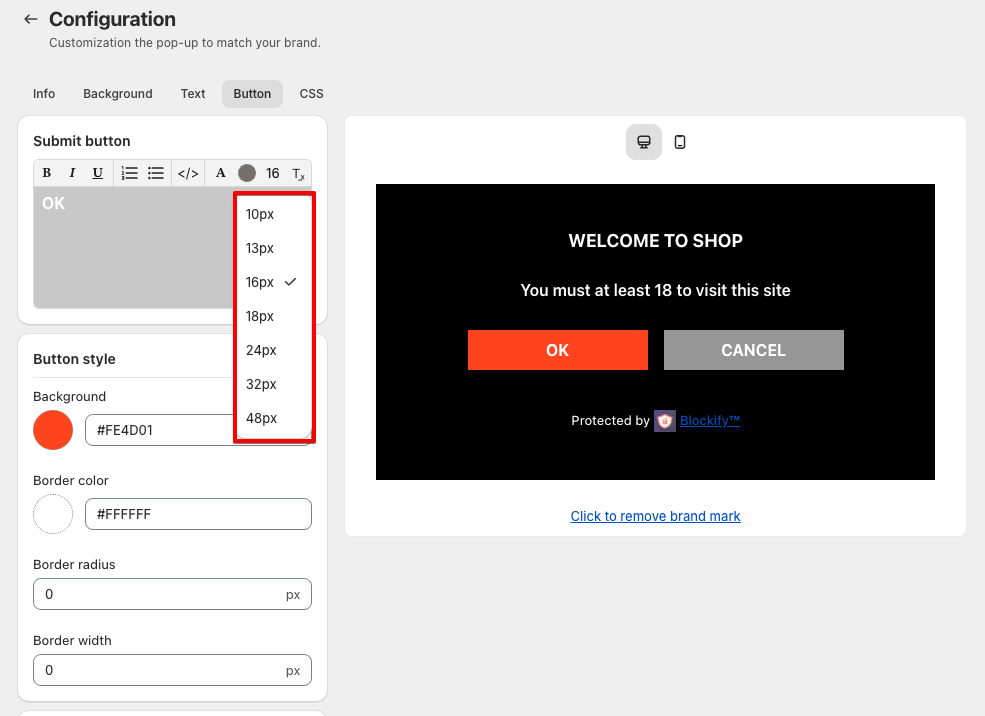
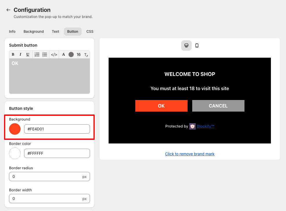
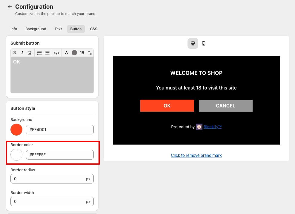
Button style
- Set the button’s background color using a hex code (e.g., #FE4D01).
- Define the border color of the button with a hex code (e.g.,
#FFFFFF).
- Enter a value in pixels to round the button’s corners (e.g.,
6px).
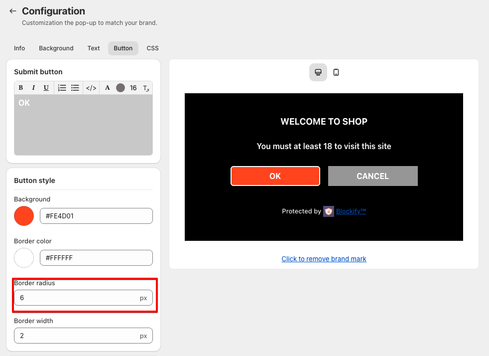
- Specify how thick the border should be (e.g.,
2px).
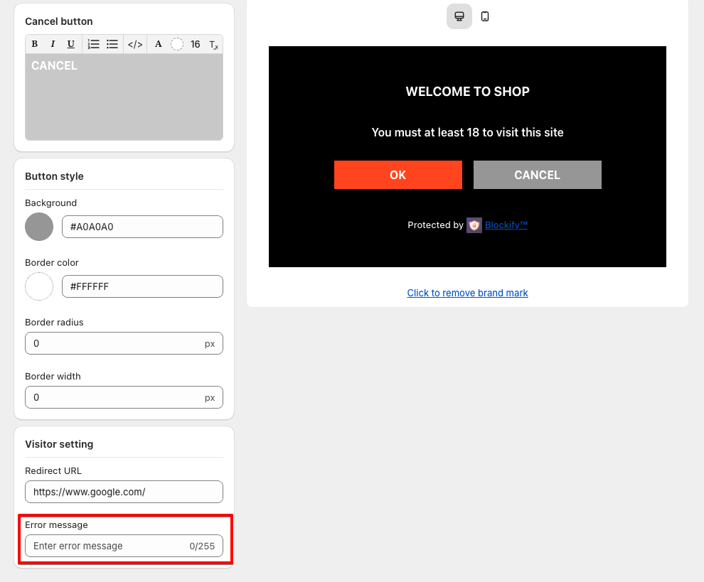
- Customize Cancel Button
Label:
- Customize the cancel button label by typing in the “Cancel button label” field.
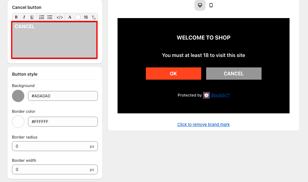
- Apply the same customizations to the cancel button as previously done with the submit button.
- Visitor setting
- Enter the URL where users will be redirected if they click “Cancel.”
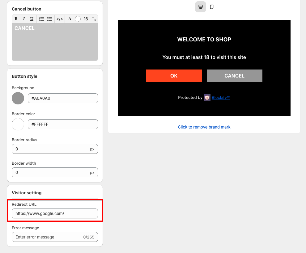
- Enter the error message to display if there is an issue with date validation.